
Tom’s of Maine, The Original Natural
About This
Project
Project
Designs do not portray in-market products.
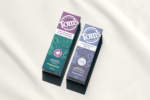
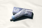
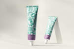
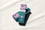
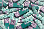
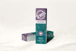
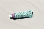
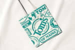
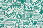
Getting lost in an increasingly crowded naturals market, Tom’s of Maine approached Nessen.co for a packaging update that would tell the story of their activist past. In addition to an updated logo that takes inspiration from one of Tom’s earliest brand marks, the identity incorporates vintage buttons and badges that both celebrate the brand’s history of doing good and reminds all of us that changing the world is hard work but worth it. The updated design system has been adapted by Tom’s across their entire lineup of oral and personal care products and constitutes the largest visual overhaul in the brand’s history.



For
Startups Ready To Scale
For
Global Leaders
For
Technology
For
Beauty And Wellness
For
A New Vision
For
Challengers Ready To Challenge
For
Established Brands
For
CPG And Beverage
For
Startups Ready To Scale
For
Global Leaders
For
Technology
For
Beauty And Wellness
For
A New Vision
For
Challengers Ready To Challenge
For
Established Brands
For
CPG And Beverage
All Rights Reserved
By Respective Owners.
©2023
By Respective Owners.
©2023
